Case study · Website
A marketing site that explains an API in one screen
javinfo.dev is a metadata search API for developers and the AI agents they build. Send the code of a Japanese adult video (JAV) release, get one clean, consistent record back. The site had to say that plainly and get people to a key without a sales call.
Three decisions
Reader first
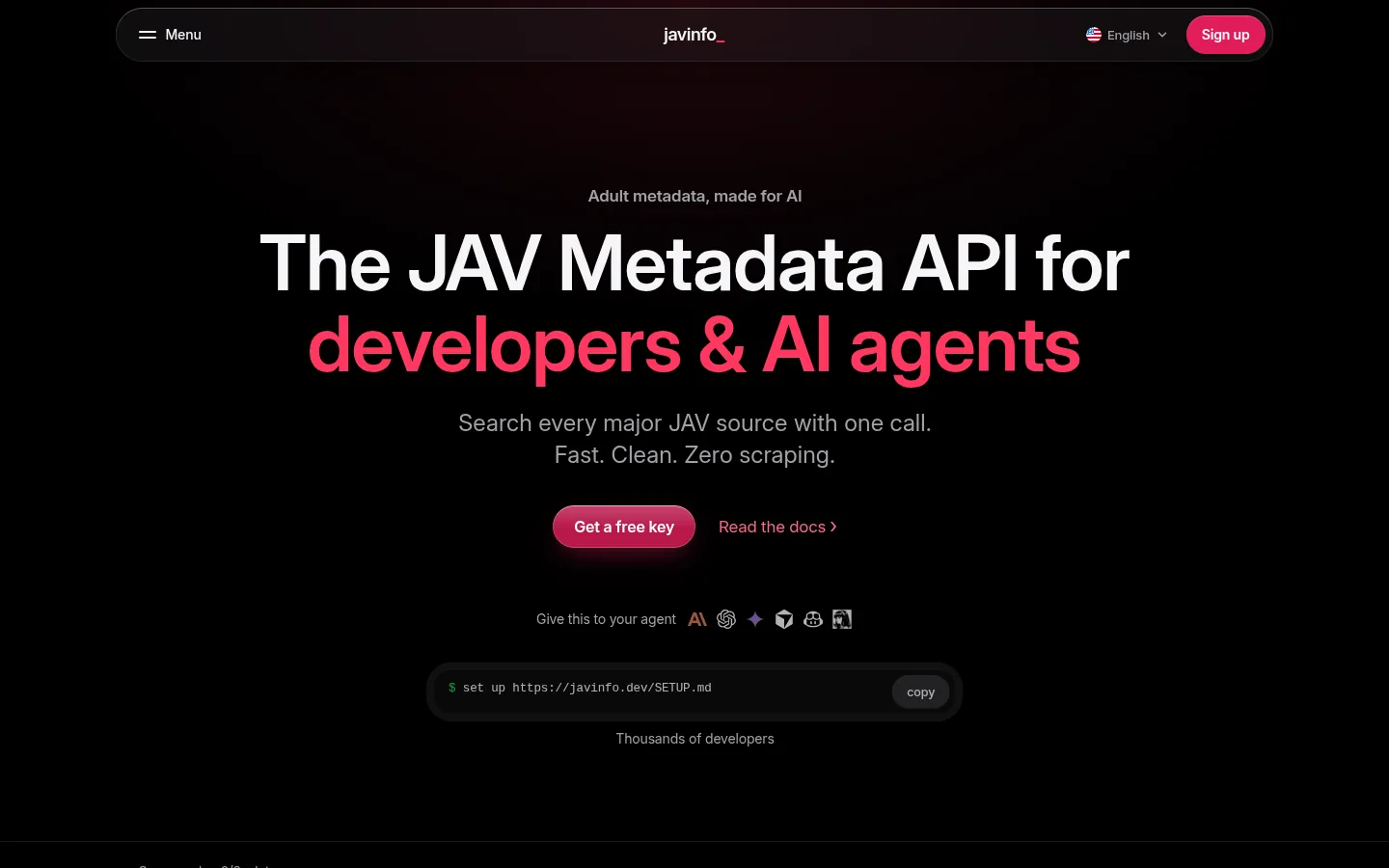
The headline names who it is for before it lists a single feature.
Proof over promises
A real request and its response sit on the homepage, not behind a sign-up.
Built to travel
Nine languages and a plain-text summary for AI tools, all from one source.
The brief
The product is technical and the subject is adult. That invites two easy mistakes: burying the page in jargon, or dressing it up. The brief was to do neither.
Say what the API is, show a request, state the limits and let the reader decide.
Name the reader first
The first screen says who the API is for, developers and AI agents, before it says anything about features. Under the headline sits one line on what it does and two actions: get a free key, or read the docs. Nothing else competes with them.
Show the request
Developers trust what they can paste. So the homepage shows a real request and the JSON that comes back, then lists every field in the response with a one-line description. A reader can judge the fit before they sign up for anything.
curl -X POST 'https://javinfo-search.p.rapidapi.com/search' \
  -H 'Content-Type: application/json' \
  -H 'X-RapidAPI-Key: YOUR_KEY' \
  -d '{ "q": "SSIS-001" }'
The “how it works” part is three short steps: send a code, the sources are checked in order, you get one normalised record. Each step is a sentence or two, because that is all it needs.
Written for agents too
More and more, the first look at an API happens inside an AI assistant. So the first screen carries a one-line setup prompt that can be pasted straight into one, and the site publishes an llms.txt file: a plain-text summary a language model can read without parsing the layout.
Plans in one table
The free and paid plans sit side by side in a single table: daily requests, rate per minute and which sources each plan covers. Keys and exact pricing live on the API marketplace, and the page says so in as many words instead of making people hunt for it.
Nine languages, one source
People who look up Japanese releases are spread across the world. The site ships in nine languages with a switcher in the header, all generated from one source, so a change lands everywhere at once.
- English
- 日本語
- 中文
- 한국어
- Español
- Français
- Bahasa Indonesia
- Русский
- Tiếng Việt
One accent, lots of contrast
The interface is near-black with a single rose accent. Code stays easy to read, the two calls to action are impossible to miss, and the page reads the same on a phone as on a wide screen. Supporting pages (questions, a blog, release notes and privacy) share the same frame, so the site feels like one thing.
- Black
#000000 - Rose
#F43F6C - Button
#E11E5B - White
#FFFFFF
Next
Got a technical product that needs explaining plainly?
Tell us what it does and who it is for.
hello@granitebay.uk